Covid-19 analysis in Romania by Mar 22, 2020
UPDATED Mar 22, 2020
I wanted to make my own predictions on the Covid-19 epidemic in Romania, where I live. Although Romanian authorities report confirmed cases several times a day, I decided to use data from Our World in Data, specifically from the full dataset csv file linked among their sources. They claim is that the data is updated daily at 20:00 London time. I can live with a small delay. By the time I uploaded this, the total number of cases in Romania was at least 433 with the first two deaths this morning, but the data that I downloaded showed 367 and no deaths. I will regularly update this post, as new data is available or as I get new ideas.
# Setup some things
library(tidyverse)
library(knitr)
library(stringr)

options(scipen = 999)
options(digits = 3)

# loading some files from my own library
base_path = "~/Dropbox/Stats/"
source(paste0(base_path, 'R library/mytheme.R'), echo=F)
source(paste0(base_path, 'R library/assorted bits.R'), echo=F)

# Get the data
setwd(paste0(base_path, "2020/Covid-19"))
download.file("https://covid.ourworldindata.org/data/ecdc/full_data.csv", "full_data.csv")
full_data <- read.csv("full_data.csv")
full_data$Date = lubridate::ymd(full_data$date)

#  Make a new location: World, excluding China
full_data_all <- full_data %>% filter(`location` %!in% c("China", "World")) %>%
  group_by(`date`) %>% summarise_if(is.numeric, sum, na.rm=T) %>%
  mutate(`location` = "World, excl. China", Date=lubridate::ymd(as.character(`date`)))
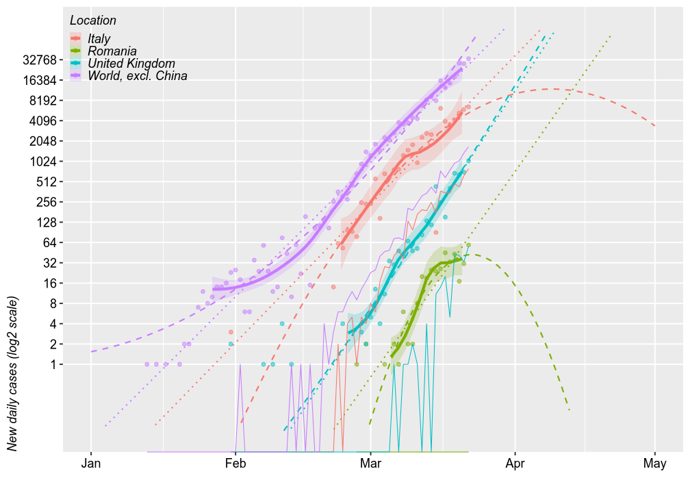
New daily cases
Comparing Romania with the world (excl. China), Italy (the worst of Europe, so far) and UK (for no particular reason), shows generally parallel projections. The chart below shows the number of new cases reported daily (on a log2 scale) and 3 forecast models. The thick solid lines are loess models. The dotted lines are linear models. The dashed lines are second order polynomial models. All forecasts are based on the most recent 2/3 of the cases.
By April 1, these models predict that Romania may have 1000 new dayly cases at worse under a log-linear increase or, under a log-quadratic model, the number of new daily cases may have already peaked and it may decrease to 8/day. However, all these models have wide error margins, especially the quadratic ones. The upper limits of these errors are further amplified in linear space.
Thin solid lines show the number of new deaths, which seem parallel to the number of new cases, just shifted 2 weeks to the right. By this logic, Romania should exprience the first deaths before April 1 and approx. 32 deaths during the first half of April.
UPDATE Mar 22, 2020: The first two deaths occured this morning, but the dataset does not includes them yet.
full_data %>%
  filter(location %in% c("Italy",
                         #"Spain",
                         "United Kingdom",
                         # "Iran",
                         "Romania")) %>%
  bind_rows(full_data_all) %>%
  mutate(`location` = forcats::fct_explicit_na(`location`, "World, excl. China")) %>%
  group_by(`location`) %>%
  mutate_if(is.integer, function(x){x[is.na(x)]=0; x}) %>%
  filter(`new_cases`+`new_deaths`>0) %>%
  # mutate(`new_cases_067` = ifelse(`total_cases`>2^(0.33*log2(max(`total_cases`))), `new_cases`, NA)) %>%
  mutate(`new_cases_067` = ifelse(`total_cases`>2^(0.33*log2(max(`new_cases`))), `new_cases`, NA)) %>%
  droplevels() %>%

  ggplot(aes(x=`Date`)) +
  geom_point(aes(y=`new_cases`, color=`location`), na.rm = F, alpha=0.5, size=1) +
  geom_smooth(se=T, aes(y=`new_cases_067`,color=`location`, fill=`location`),fullrange=T, alpha=0.2) +
  geom_smooth(method="lm", se=F, aes(y=`new_cases_067`,color=`location`),fullrange=T, lty="dotted", size=0.5) +
  geom_smooth(method="lm", se=F, aes(y=`new_cases_067`,color=`location`),fullrange=T, lty="dashed", size=0.5, formula=y~poly(x,2)) +
  geom_line(aes(y=`new_deaths`, color=`location`), lty="solid", size=0.25) +
  scale_y_log10("New daily cases (log2 scale)", limits=c(0.1, 100000), breaks=2^c(0:15)) +
  scale_x_date("", limits = c(as.Date.character("2020-01-01"), as.Date.character("2020-05-01"))) +
  legend.top_left + no.minor_grid.y +
  labs(color="Location", fill="Location")
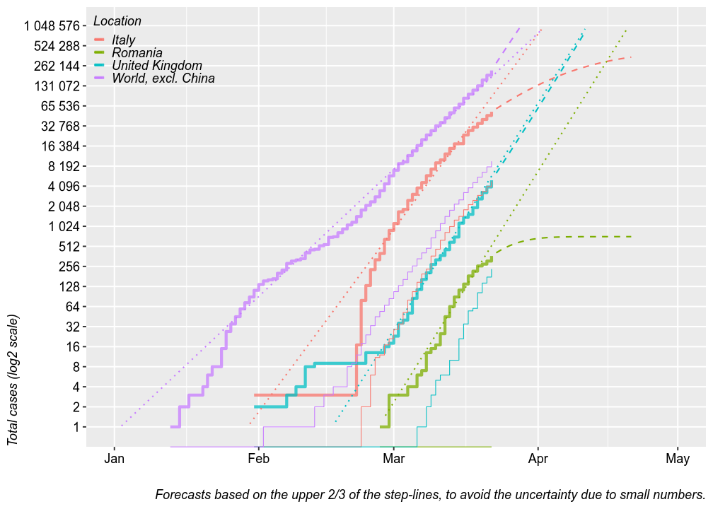
Total cases
The chart below plots the total number of confirmed cases (thick step-lines) and deaths (thin step-lines) for several locations. I added linear and second order polynomial forecasts (dashed and dotted lines) for the total number of cases, based on the upper 2/3 of each location’s step-line. Thsese forecasts could be seen as worst-case and best-case scenarios. The linear forcast is based on a linear regression of the log of the total number of cases by date, which means it is an exponential fit with a linear y axis. The polynmial fit is based on a polynomial regression of the log of number new daily cases by date. The model tren predics the number of total cases from the estimated number of new cases.
For Romania, these models predict 8000 cases at worse by April 1 or the end of the epideminc at 500 cases. Keep in mind that these models have wide margins of error.
data <- full_data %>%
  filter(location %in% c("Italy",
                         # "Spain",
                         "United Kingdom",
                         # "Iran",
                         "Romania")) %>%
  bind_rows(full_data_all) %>%
  mutate(`location` = forcats::fct_explicit_na(`location`, "World, excl. China")) %>%
  group_by(`location`) %>%
  mutate_if(is.integer, function(x){x[is.na(x)]=0; x}) %>%
  filter(`new_cases`+`new_deaths`>0) %>%
  # mutate(`new_cases_067` = ifelse(`total_cases`>2^(0.33*log2(max(`total_cases`))), `new_cases`, NA)) %>%
  mutate(`new_cases_067` = ifelse(`total_cases`>2^(0.33*log2(max(`new_cases`))), `new_cases`, NA)) %>%
  filter(`total_cases`>0) %>%
  mutate(`total_cases_067` = ifelse(`total_cases`>2^(0.33*log2(max(`total_cases`))), `total_cases`, NA)) %>%
  droplevels() #%>%

for (country in levels(data$location)) {
  totals <- data$total_cases[data$location==country]
  dates <- data$Date[data$location==country]

  news1 <- data$new_cases_067[data$location==country] %>% log2
  reg1 <- lm(news1~poly(dates, 2))
  pred_new1 <- 2^predict(reg1, newdata = data.frame(dates=lubridate::today()+c(1:30)))
  pred_total1 <- rep(NA, 30)
  pred_total1[1] = totals[length(totals)] + pred_new1[1]
  for (i in 2:30)
    pred_total1[i] <- pred_total1[i-1] + pred_new1[i]

  # news2 <- data$new_cases_067[data$location==country]
  # reg2 <- lm(news2~poly(dates, 2))
  # pred_new2 <- predict(reg2, newdata = data.frame(dates=lubridate::today()+c(1:30)))
  # pred_total2 <- rep(NA, 30)
  # pred_total2[1] = totals[length(totals)] + pred_new2[1]
  # for (i in 2:30)
  #   pred_total2[i] <- pred_total2[i-1] + pred_new2[i]

  new_rows <- data.frame(`location`=country,
                         `new_cases1` = pred_new1, `pred_total_cases1` = pred_total1,
                         # `new_cases2` = pred_new2, `pred_total_cases2` = pred_total2,
                         `Date` = lubridate::today()+c(1:30))
  data <- bind_rows(data, new_rows)
}

data %>% ggplot(aes(x=`Date`)) +
  geom_step(aes(y=`total_cases`, color=`location`), na.rm = F, size=1, alpha=0.5) +
  geom_line(aes(y=`pred_total_cases1`, color=`location`), size=0.5, lty="dashed") +
  # geom_line(aes(y=`pred_total_cases2`, color=`location`), size=0.5, lty="dashed") +

  geom_smooth(method="lm", se=F, aes(y=`total_cases_067`, color=`location`),fullrange=T, size=0.5, lty="dotted") +

  geom_step(aes(y=`total_deaths`, color=`location`), size=0.25) +
  scale_y_log10("Total cases (log2 scale)", limits=c(1, 1000000), breaks=2^c(0:20), labels=scales::number_format(accuracy = 1)) +
  scale_x_date("", limits = c(as.Date.character("2020-01-01"), as.Date.character("2020-05-01"))) +
  legend.top_left + no.minor_grid.y +
  labs(color="Location", fill="Location",
       caption = str_wrap("Forecasts based on the upper 2/3 of the step-lines, to avoid the uncertainty due to small numbers.", 120))
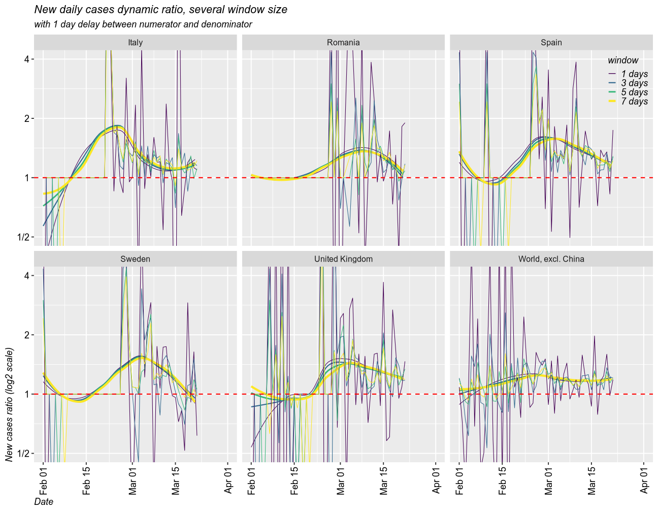
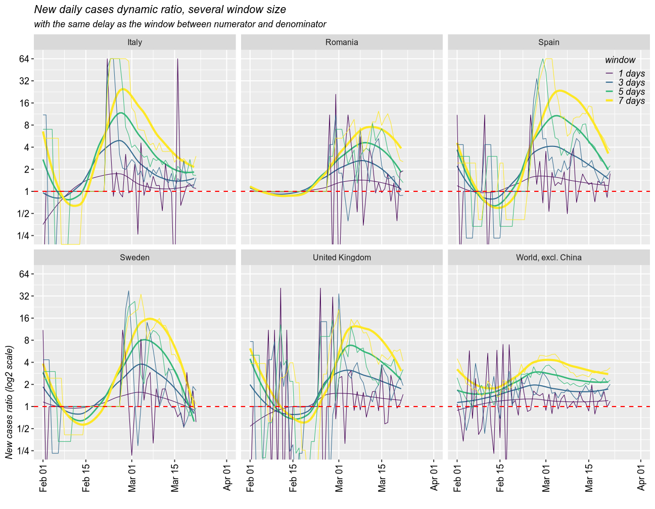
Growth rate of the epidemic
As a measure for the growth rate of the epidemic, I calculated the rolling ratio between the new cases in one window of time and that in a previous window. The size of any given window can be set to any number of days (I selected 1, 3, 5 and 7 days). The denominator can be set with a delay. I created two scenarios, one with 1 day delay and another one with a delay equal to window size. I coded the size of the window by color (dark = 1 day, yellow = 7 days).
When the ratio is above 1, the epidemic is getting worse (exponential growth). 1 means linear growth (same number of cases each day). Below 1 means the epidemic is ending (fewer and fewer new cases).
# some setup paramenters
my_colors <- viridis::viridis(7) # custom colors
lim <- 64 # limit the size of sudden change in the number of cases. 64 time one day over the previous seems reasonable
def = 0.1 # replace days with no cases, to make maths work

rdiff <- function(x, windows = 3, delay=1, default = 0.1, by = NULL) {
  retval <- rep(default, length(x))
  for (gr in levels(droplevels(by))) { # for every country
    y <- x[by==gr]
    y <- zoo::rollsumr(as.numeric(y), windows, align = "right", fill = 1) # sum up all cases in a moving window
    y <- y / lag(y, default = 1, n = delay) # ratio to the previous window
    retval[by==gr] <- y
  }
  retval

}
1 day delay scenario
Taking moving windows of 1 (the fastest and most instable), 3, 5, and 7 days (smoothed over 1 week), with a delay of 1 day, I found that all countries have the epidemic under control. In all cases, the epidemic is still growing, but the growth rate has slowed down and it approaches 1 (linear growth) and will eventually fall below 1. The world is still under exponential grwoth, as new countries enter the exponential phase of the epidemic.
full_data %>% filter(location %in% c("Romania", "Italy", "Spain", "United Kingdom", "Iran")) %>%
  bind_rows(full_data_all) %>%
  mutate(`location` = forcats::fct_explicit_na(`location`, "World, excl. China ")) %>%
  filter(location %in% c("Romania", "Italy", "Spain", "United Kingdom", "Iran", "World, excl. China")) %>%
  mutate_if(is.integer, function(x){x[is.na(x)]=0; x+def}) %>%
  mutate(`new_cases_ratio_1` = rdiff(`new_cases`, default = def, windows=1, by=`location`, delay = 1) %>%
           limit_between(1/lim, lim, to.string = F)) %>%
  mutate(`new_cases_ratio_2` = rdiff(`new_cases`, default = def, windows=2, by=`location`, delay = 1) %>%
           limit_between(1/lim, lim, to.string = F)) %>%
  mutate(`new_cases_ratio_3` = rdiff(`new_cases`, default = def, windows=3, by=`location`, delay = 1) %>%
           limit_between(1/lim, lim, to.string = F)) %>%
  mutate(`new_cases_ratio_4` = rdiff(`new_cases`, default = def, windows=4, by=`location`, delay = 1) %>%
           limit_between(1/lim, lim, to.string = F)) %>%
  mutate(`new_cases_ratio_5` = rdiff(`new_cases`, default = def, windows=5, by=`location`, delay = 1) %>%
           limit_between(1/lim, lim, to.string = F)) %>%
  mutate(`new_cases_ratio_6` = rdiff(`new_cases`, default = def, windows=6, by=`location`, delay = 1) %>%
           limit_between(1/lim, lim, to.string = F)) %>%
  mutate(`new_cases_ratio_7` = rdiff(`new_cases`, default = def, windows=7, by=`location`, delay = 1) %>%
           limit_between(1/lim, lim, to.string = F)) %>%
  droplevels() %>%
  tidyr::gather("window", "new_cases_ratio", "new_cases_ratio_" %+% c(1, 3, 5, 7)) %>%
  mutate(`window` = str_remove_all(`window`, "new_cases_ratio_") %+% " days") %>%
  ggplot(aes(x=`Date`, color=`window`)) + facet_wrap(`location`~., nrow=2)+
  geom_smooth(se=F, aes(y=`new_cases_ratio`, size=`window`), fullrange=T) +
  scale_size_manual(values = c(0.25, 0.5, 0.67, 1))+
  geom_line(aes(y=`new_cases_ratio`), size=0.25) + #geom_point(aes(y=`new_cases_ratio`)) +
  geom_hline(yintercept = 1, color = "red", lty="dashed")+
  scale_color_viridis_d("window")+
  scale_y_log10("New cases ratio (log2 scale)", breaks = 2^seq(-10, 10), limits = c(-lim,lim),
                labels = c("1/" %+% 2^(10:1), "1", 2^(1:10))) +
  scale_x_date(limits = c(as.Date.character("2020-02-01"), as.Date.character("2020-04-01"))) +
  coord_cartesian(ylim=c(1/2, 4)) +
  labs(title = "New daily cases dynamic ratio, several window size",
       subtitle = "with 1 day delay between numerator and denominator")
Delays of variable sizes scenario
Taking moving windows of 1 (the fastest and most instable), 3, 5, and 7 days (smoothed over 1 week), with a delay of the same sizes, I found a similar story.
full_data %>% filter(location %in% c("Romania", "Italy", "Spain", "United Kingdom", "Iran")) %>%
  bind_rows(full_data_all) %>%
  mutate(`location` = forcats::fct_explicit_na(`location`, "World, excl. China ")) %>%
  filter(location %in% c("Romania", "Italy", "Spain", "United Kingdom", "Iran", "World, excl. China")) %>%
  mutate_if(is.integer, function(x){x[is.na(x)]=0; x+def}) %>%
  mutate(`new_cases_ratio_1` = rdiff(`new_cases`, default = def, windows=1, by=`location`, delay = 1) %>%
           limit_between(1/lim, lim, to.string = F)) %>%
  mutate(`new_cases_ratio_2` = rdiff(`new_cases`, default = def, windows=2, by=`location`, delay = 2) %>%
           limit_between(1/lim, lim, to.string = F)) %>%
  mutate(`new_cases_ratio_3` = rdiff(`new_cases`, default = def, windows=3, by=`location`, delay = 3) %>%
           limit_between(1/lim, lim, to.string = F)) %>%
  mutate(`new_cases_ratio_4` = rdiff(`new_cases`, default = def, windows=4, by=`location`, delay = 4) %>%
           limit_between(1/lim, lim, to.string = F)) %>%
  mutate(`new_cases_ratio_5` = rdiff(`new_cases`, default = def, windows=5, by=`location`, delay = 5) %>%
           limit_between(1/lim, lim, to.string = F)) %>%
  mutate(`new_cases_ratio_6` = rdiff(`new_cases`, default = def, windows=6, by=`location`, delay = 6) %>%
           limit_between(1/lim, lim, to.string = F)) %>%
  mutate(`new_cases_ratio_7` = rdiff(`new_cases`, default = def, windows=7, by=`location`, delay = 7) %>%
           limit_between(1/lim, lim, to.string = F)) %>%
  droplevels() %>%
  tidyr::gather("window", "new_cases_ratio", "new_cases_ratio_" %+% c(1, 3, 5, 7)) %>%
  mutate(`window` = str_remove_all(`window`, "new_cases_ratio_") %+% " days") %>%
  # mutate(`new_cases_ratio_march` = ifelse(`Date`>lubridate::ymd("2020-02-15"), `new_cases_ratio`, NA)) %>%
  # mutate(`new_cases_ratio_march` = ifelse(`total_cases`>2^(0.33*log2(max(`new_cases`))), `new_cases_ratio`, NA)) %>%
  ggplot(aes(x=`Date`, color=`window`)) + facet_wrap(`location`~., nrow=2)+
  geom_smooth(se=F, aes(y=`new_cases_ratio`, size=`window`), fullrange=T) +
  # geom_smooth(se=F, method="lm", aes(y=`new_cases_ratio_march`, size=`window`, weight=`Date`), fullrange=T, formula = y~poly(x, 2), color="black") +
  scale_size_manual(values = c(0.25, 0.5, 0.67, 1))+
  geom_line(aes(y=`new_cases_ratio`), size=0.25) + #geom_point(aes(y=`new_cases_ratio`)) +
  geom_hline(yintercept = 1, color = "red", lty="dashed")+
  scale_color_viridis_d("window")+
  scale_y_log10("New cases ratio (log2 scale)", breaks = 2^seq(-10, 10), limits = c(-lim,lim),
                labels = c("1/" %+% 2^(10:1), "1", 2^(1:10))) +
  scale_x_date("", limits = c(as.Date.character("2020-02-01"), as.Date.character("2020-04-01"))) +
  coord_cartesian(ylim=c(1/4, 64)) + perpendicular.labels.x +
  labs(title = "New daily cases dynamic ratio, several window size",
       subtitle = "with the same delay as the window between numerator and denominator")
Final remarks
Althogh still in exponential growth, Romania seems to keep the epidemic under control, and is expected to return to linear growth and eventual resolution within several weeks. A total number of confirmed cases in the thousands is likely before summer. Quarantine measures seem effective. No deaths so far is good sign, although the first deaths are likely to occur soon.
UPDATE Mar 22, 2020: The first two deaths occured this morning, but the dataset does not includes them yet.
My prediction is that we will soon enter a period of linear growth and no complete resolution this year. Quarantine measures may not be possible to a sufficient level during autum due to economic reasons, which means that during the next cold season we may experience a much more severe epidemic, with causalties in the hundreds or thousands.
This report has severe limitations due to the nature of the data. It is impossible to calculate the real number of cases among untested individuals, since almost all tests were performed in people already at higher-than-average likelyhood of being infected. Long-term research is needed to develop tests that are accurate in predicitng clinical disease and differenctiating it form carrier status.