Covid-19 analysis in Romania by Apr 10, 2020
Rerun of Apr 10, 2020
library(tidyverse)
options(scipen = 999)
options(digits = 3)
library(knitr)
library(stringr)

# loading some files from my own library
base_path = "~/Dropbox/Stats/"
source(paste0(base_path, 'R library/mytheme.R'), echo=F)
source(paste0(base_path, 'R library/assorted bits.R'), echo=F)
# source(paste0(base_path, 'R library/custom_charts.R'), echo=F)
Data source
I wanted to make my own predictions on the Covid-19 epidemic in Romania, where I live. I decided to use data from Our World in Data, specifically from the full_data.csv file linked among their sources. They claim is that the data is updated daily at 20:00 London time. I can live with that delay. By the time I uploaded this, the total number of cases in Romania was at least 5467 with the 270 deaths, but the data that I downloaded showed 5202 and 229 deaths. I will regularly update this post, as new data is available or as I get new ideas.
setwd(paste0(base_path, "2020/Covid-19"))
download.file("https://covid.ourworldindata.org/data/ecdc/full_data.csv", "full_data.csv")
full_data <- read.csv("full_data.csv")
full_data$Date = lubridate::ymd(full_data$date)

population <- readr::read_csv("API_SP.POP.TOTL_DS2_en_csv_v2_887275.csv",
                              skip = 3,
                              col_types = cols(`Country Code` = col_skip(),
                                               `Indicator Code` = col_skip(),
                                               `Indicator Name` = col_skip()) )
population %<>%
  tidyr::gather("Year", "Population", -c("Country Name")) %>% na.omit %>%
  group_by(`Country Name`) %>%
  summarise(`Population` = last(`Population`)) %>%
  mutate(`Population` = `Population` / (10^6))

full_data <- merge(x = full_data, y = population, by.x = "location", by.y = "Country Name") %>% arrange(`location`, `Date`)

#  Make a new location: World, excluding China
full_data_all <- full_data %>% filter(`location` %!in% c("China", "World")) %>%
  group_by(`date`) %>% summarise_if(is.numeric, sum, na.rm=T) %>%
  mutate(`location` = "World, excl. China", Date=lubridate::ymd(as.character(`date`)))

# full_data %>% filter(location %in% c("Romania"))
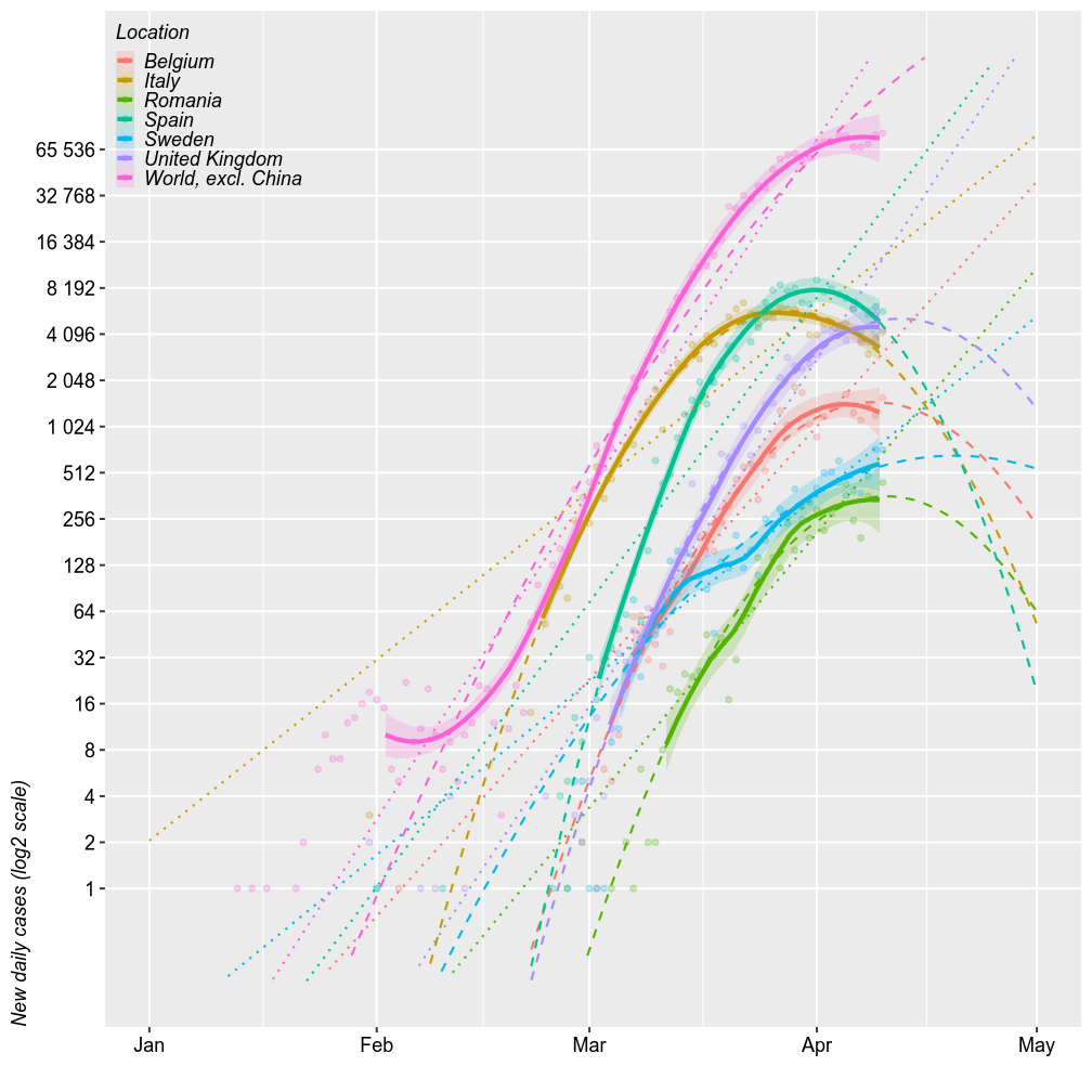
New daily cases and deaths
Comparing Romania with the world (excl. China), Italy / Spain (the worst of Europe, so far) and UK / Belgium (for no particular reason), shows generally parallel projections. The chart below shows the number of new cases reported daily (on a log2 scale) and 3 forecast models. The thick solid lines are loess models. The dotted lines are log-linear models. The dashed lines are second order log-polynomial models. All forecasts are based on the most recent 2/3 of the cases.
My previous runs of the models overestimated the number of cases in Romania. I prediced up to 1000 new daily cases but there were only ~300 new cases / day. At this point, I predict between a peak approximativey to 512 in the next week (best case scenario under a log-quadratic model) and up to 4000 cases (worst scenario of uninterruped log-linear growth) by April 15.
However, all these models have wide error margins, especially the quadratic ones. The upper limits of these errors are further amplified in linear space.
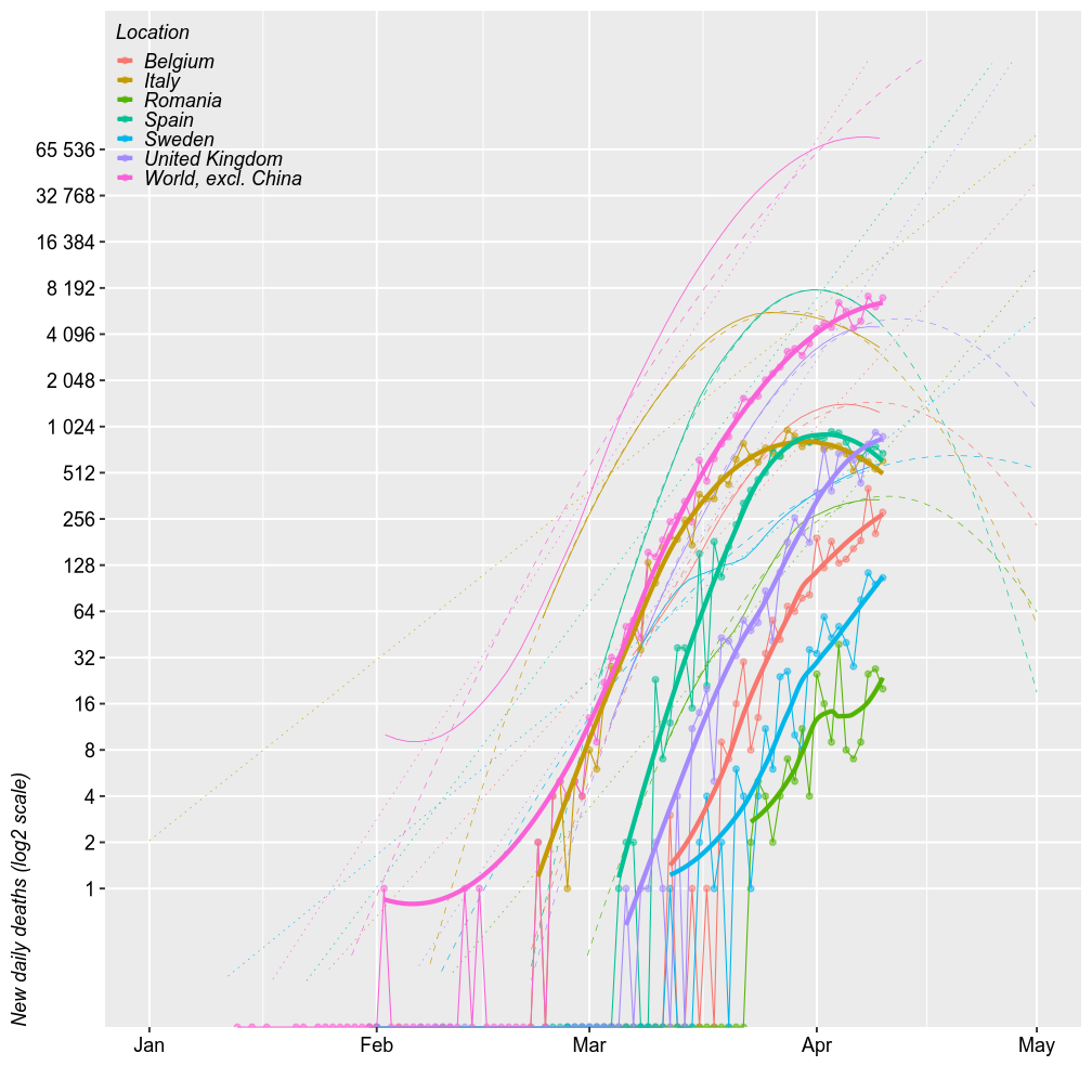
The number of new deaths seem parallel to the number of new cases, just shifted 2 weeks to the right. By this logic, Romania should exprience the up to 100 deaths/day by April 15 (probably within to 32-64).
full_data %>%
  filter(location %in% c("Italy", "Spain",
                         "Belgium", "United Kingdom",
                         "Sweden",
                         "Romania")) %>%
  bind_rows(full_data_all) %>%
  mutate(`location` = forcats::fct_explicit_na(`location`, "World, excl. China")) %>%
  group_by(`location`) %>%
  mutate_if(is.integer, function(x) { x[is.na(x)]=0; x } ) %>%
  filter(`new_cases`+`new_deaths`>0) %>%
  mutate(`new_cases_067` = ifelse(`total_cases`>2^(0.33*log2(max(`total_cases`))), `new_cases`, NA)) %>%
  droplevels() %>%

  ggplot(aes(x=`Date`)) +
  geom_point(aes(y=`new_cases`, color=`location`), na.rm = F, alpha=0.25, size=1) +
  geom_smooth(se=T, aes(y=`new_cases_067`,color=`location`, fill=`location`),fullrange=T, alpha=0.2) +
  geom_smooth(method="lm", se=F, aes(y=`new_cases_067`,color=`location`),fullrange=T, lty="dotted", size=0.5) +

  geom_smooth(aes(y=`new_cases_067`, color=`location`, weight = as.numeric(`Date`-min(`Date`))),
              method="lm", formula=y~poly(x,2), se=F, fullrange=T, lty="dashed", size=0.5) +
  # geom_smooth(aes(y=`new_cases_067`, color=`location`),
  #             method="lm", formula=y~poly(x,2), se=F, fullrange=T, lty="dashed", size=0.5) +

  # geom_line(aes(y=`new_deaths`, color=`location`), lty="solid", size=0.25) +
  scale_y_log10("New daily cases (log2 scale)", limits=2^c(-2, 18), breaks=2^c(0:16), labels=scales::label_number_auto()) +
  scale_x_date("", limits = c(as.Date.character("2020-01-01"), as.Date.character("2020-05-01"))) +
  legend.top_left + no.minor_grid.y +
  labs(color="Location", fill="Location")
full_data %>%
  filter(location %in% c("Italy", "Spain",
                         "Belgium", "United Kingdom",
                         "Sweden",
                         "Romania")) %>%
  bind_rows(full_data_all) %>%
  mutate(`location` = forcats::fct_explicit_na(`location`, "World, excl. China")) %>%
  group_by(`location`) %>%
  mutate_if(is.integer, function(x) { x[is.na(x)]=0; x } ) %>%
  filter(`new_cases`+`new_deaths`>0) %>%
  mutate(`new_cases_067` = ifelse(`total_cases`>2^(0.33*log2(max(`total_cases`))), `new_cases`, NA)) %>%
  droplevels() %>%

  ggplot(aes(x=`Date`)) +
  # geom_point(aes(y=`new_cases`, color=`location`), na.rm = F, alpha=0.25, size=1) +
  geom_smooth(se=F, aes(y=`new_cases_067`,color=`location`, fill=`location`),fullrange=T, size=0.2) +
  geom_smooth(method="lm", se=F, aes(y=`new_cases_067`,color=`location`),fullrange=T, lty="dotted", size=0.15) +

  geom_smooth(aes(y=`new_cases_067`, color=`location`, weight = as.numeric(`Date`-min(`Date`))),
              method="lm", formula=y~poly(x,2), se=F, fullrange=T, lty="dashed", size=0.15) +
  # geom_smooth(aes(y=`new_cases_067`, color=`location`),
  #             method="lm", formula=y~poly(x,2), se=F, fullrange=T, lty="dashed", size=0.5) +

  geom_point(aes(y=`new_deaths`, color=`location`), na.rm = F, alpha=0.5, size=1) +
  geom_line(aes(y=`new_deaths`, color=`location`), size=0.25) +
  geom_smooth(aes(y=`new_deaths`, color=`location`), se=F) +
  scale_y_log10("New daily deaths (log2 scale)", limits=2^c(-2, 18), breaks=2^c(0:16), labels=scales::label_number_auto()) +
  scale_x_date("", limits = c(as.Date.character("2020-01-01"), as.Date.character("2020-05-01"))) +
  legend.top_left + no.minor_grid.y +
  labs(color="Location", fill="Location")
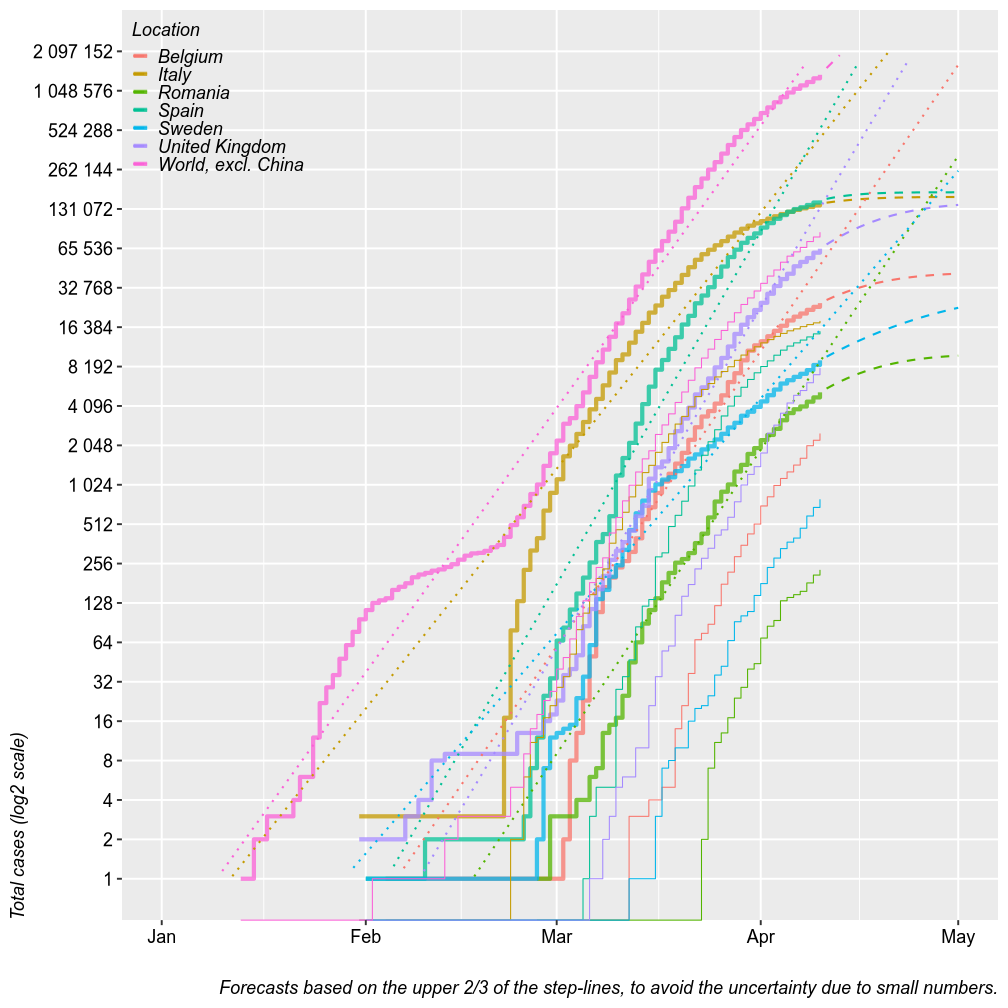
Total cases
The chart below plots the total number of confirmed cases (thick step-lines) and deaths (thin step-lines) for several locations. I added linear and second order polynomial forecasts (dashed and dotted lines) for the total number of cases, based on the upper 2/3 of each location’s step-line. Thsese forecasts could be seen as worst-case and best-case scenarios. The linear forcast is based on a linear regression of the log of the total number of cases by date, which means it is an exponential fit with a linear y axis. The polynmial fit is based on a polynomial regression of the log of number new daily cases by date. The model tren predics the number of total cases from the estimated number of new cases.
For Romania, these models predict a plateau at 8000 cases after April 15 at best, under a log-polynomial growth or up to 50k cases under uninterruped exponential growth. Keep in mind that these models have wide margins of error. Also, keep in mind that with a limited testing capacity it may be difficut to count this many cases or, with increased testing capacity, the number of cases may artificially increase. So far, Romania tested 25000 persons and confirmed 2500 cases. This 1/10 ratio has been fairly constant in Romania and I have no reason to believe that it will change.
It may be more usefull from now on to study the number of deaths rather than the number of cases. It is a safer piece of information that varries little with the testing capacity. It captures with a predictable rate the number of actual cases, not only tested (adjusted by age, of course). With >100 cases, predictive margins of error became acceptable.
data <- full_data %>%
  filter(location %in% c("Italy", "Spain",
                         "Belgium", "United Kingdom",
                         "Sweden",
                         "Romania")) %>%
  bind_rows(full_data_all) %>%
  mutate(`location` = forcats::fct_explicit_na(`location`, "World, excl. China")) %>%
  group_by(`location`) %>%
  mutate_if(is.integer, function(x){x[is.na(x)]=0; x}) %>%
  filter(`new_cases`+`new_deaths`>0) %>%
  # mutate(`new_cases_067` = ifelse(`total_cases`>2^(0.33*log2(max(`total_cases`))), `new_cases`, NA)) %>%
  mutate(`new_cases_067` = ifelse(`total_cases`>2^(0.33*log2(max(`total_cases`))), `new_cases`, NA)) %>%
  filter(`total_cases`>0) %>%
  mutate(`total_cases_067` = ifelse(`total_cases`>2^(0.33*log2(max(`total_cases`))), `total_cases`, NA)) %>%
  droplevels() #%>%

for (country in levels(data$location)) {
  totals <- data$total_cases[data$location==country]
  dates <- data$Date[data$location==country]

  news1 <- data$new_cases_067[data$location==country] %>% log2
  reg1 <- lm(news1~poly(dates, 2), weights = as.numeric(dates-min(dates)))
  pred_new1 <- 2^predict(reg1, newdata = data.frame(dates=lubridate::today()+c(1:30)))
  pred_total1 <- rep(NA, 30)
  pred_total1[1] = totals[length(totals)] + pred_new1[1]
  for (i in 2:30)
    pred_total1[i] <- pred_total1[i-1] + pred_new1[i]

  # news2 <- data$new_cases_067[data$location==country]
  # reg2 <- lm(news2~poly(dates, 2))
  # pred_new2 <- predict(reg2, newdata = data.frame(dates=lubridate::today()+c(1:30)))
  # pred_total2 <- rep(NA, 30)
  # pred_total2[1] = totals[length(totals)] + pred_new2[1]
  # for (i in 2:30)
  #   pred_total2[i] <- pred_total2[i-1] + pred_new2[i]

  new_rows <- data.frame(`location`=country,
                         `new_cases1` = pred_new1, `pred_total_cases1` = pred_total1,
                         # `new_cases2` = pred_new2, `pred_total_cases2` = pred_total2,
                         `Date` = lubridate::today()+c(1:30))
  data <- bind_rows(data, new_rows)
}

data %>% ggplot(aes(x=`Date`)) +
  geom_step(aes(y=`total_cases`, color=`location`), na.rm = F, size=1, alpha=0.75) +
  geom_line(aes(y=`pred_total_cases1`, color=`location`), size=0.5, lty="dashed") +
  # geom_line(aes(y=`pred_total_cases2`, color=`location`), size=0.5, lty="dashed") +

  geom_smooth(method="lm", se=F, aes(y=`total_cases_067`, color=`location`),fullrange=T, size=0.5, lty="dotted") +

  geom_step(aes(y=`total_deaths`, color=`location`), size=0.25) +
  scale_y_log10("Total cases (log2 scale)", limits=2^c(0, 21), breaks=2^c(0:21), labels=scales::number_format(accuracy = 1)) +
  scale_x_date("", limits = c(as.Date.character("2020-01-01"), as.Date.character("2020-05-01"))) +
  legend.top_left + no.minor_grid.y +
  labs(color="Location", fill="Location",
       caption = str_wrap("Forecasts based on the upper 2/3 of the step-lines, to avoid the uncertainty due to small numbers.", 120))
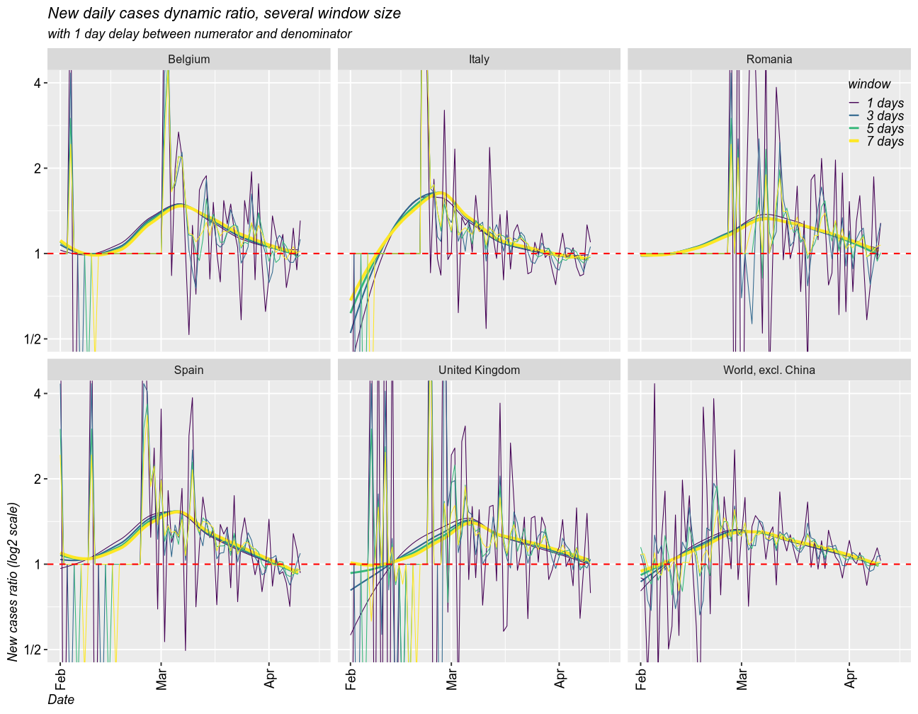
Growth rate of the epidemic
As a measure for the growth rate of the epidemic, I calculated the rolling ratio between the new cases in one window of time and that in a previous window. The size of any given window can be set to any number of days (I selected 1, 3, 5 and 7 days). The denominator can be set with a delay. I created two scenarios, one with 1 day delay and another one with a delay equal to window size. I coded the size of the window by color (dark = 1 day, yellow = 7 days).
When the ratio is above 1, the epidemic is getting worse (exponential growth). 1 means linear growth (same number of cases each day). Below 1 means the epidemic is ending (fewer and fewer new cases).
# some setup paramenters
my_colors <- viridis::viridis(7) # custom colors
lim <- 64 # limit the size of sudden change in the number of cases. 64 time one day over the previous seems reasonable
def = 0.1 # replace days with no cases, to make maths work

rdiff <- function(x, windows = 3, delay=1, default = 0.1, by = NULL) {
  retval <- rep(default, length(x))
  for (gr in levels(droplevels(by))) { # for every country
    y <- x[by==gr]
    y <- zoo::rollsumr(as.numeric(y), windows, align = "right", fill = 1) # sum up all cases in a moving window
    y <- y / lag(y, default = 1, n = delay) # ratio to the previous window
    retval[by==gr] <- y
  }
  retval

}
1 day delay scenario
Taking moving windows of 1 (the fastest and most instable), 3, 5, and 7 days (smoothed over 1 week), with a delay of 1 day, I found that all countries have the epidemic under control. In all cases, the epidemic is still growing, but the growth rate has slowed down and it approaches 1 (linear growth) and will eventually fall below 1. The world is still under exponential grwoth, as new countries enter the exponential phase of the epidemic.
full_data %>% #filter(location %in% c("Romania", "Italy", "Spain", "United Kingdom", "Belgium")) %>%
  bind_rows(full_data_all) %>%
  mutate(`location` = forcats::fct_explicit_na(`location`, "World, excl. China ")) %>%
  filter(location %in% c("Romania", "Italy", "Spain", "United Kingdom", "Belgium",
                         "World, excl. China")) %>%
  mutate_if(is.integer, function(x){x[is.na(x)]=0; x+def}) %>%
  mutate(`new_cases_ratio_1` = rdiff(`new_cases`, default = def, windows=1, by=`location`, delay = 1) %>%
           limit_between(1/lim, lim, to.string = F)) %>%
  mutate(`new_cases_ratio_2` = rdiff(`new_cases`, default = def, windows=2, by=`location`, delay = 1) %>%
           limit_between(1/lim, lim, to.string = F)) %>%
  mutate(`new_cases_ratio_3` = rdiff(`new_cases`, default = def, windows=3, by=`location`, delay = 1) %>%
           limit_between(1/lim, lim, to.string = F)) %>%
  mutate(`new_cases_ratio_4` = rdiff(`new_cases`, default = def, windows=4, by=`location`, delay = 1) %>%
           limit_between(1/lim, lim, to.string = F)) %>%
  mutate(`new_cases_ratio_5` = rdiff(`new_cases`, default = def, windows=5, by=`location`, delay = 1) %>%
           limit_between(1/lim, lim, to.string = F)) %>%
  mutate(`new_cases_ratio_6` = rdiff(`new_cases`, default = def, windows=6, by=`location`, delay = 1) %>%
           limit_between(1/lim, lim, to.string = F)) %>%
  mutate(`new_cases_ratio_7` = rdiff(`new_cases`, default = def, windows=7, by=`location`, delay = 1) %>%
           limit_between(1/lim, lim, to.string = F)) %>%
  droplevels() %>%
  tidyr::gather("window", "new_cases_ratio", "new_cases_ratio_" %+% c(1, 3, 5, 7)) %>%
  mutate(`window` = str_remove_all(`window`, "new_cases_ratio_") %+% " days") %>%
  ggplot(aes(x=`Date`, color=`window`)) + facet_wrap(`location`~., nrow=2)+
  geom_smooth(se=F, aes(y=`new_cases_ratio`, size=`window`), fullrange=T) +
  scale_size_manual(values = c(0.25, 0.5, 0.67, 1))+
  geom_line(aes(y=`new_cases_ratio`), size=0.25) + #geom_point(aes(y=`new_cases_ratio`)) +
  geom_hline(yintercept = 1, color = "red", lty="dashed")+
  scale_color_viridis_d("window")+
  scale_y_log10("New cases ratio (log2 scale)", breaks = 2^seq(-10, 10), limits = c(-lim,lim),
                labels = c("1/" %+% 2^(10:1), "1", 2^(1:10))) +
  scale_x_date(limits = c(as.Date.character("2020-02-01"), as.Date.character("2020-04-15"))) +
  coord_cartesian(ylim=c(1/2, 4)) + perpendicular.labels.x +
  labs(title = "New daily cases dynamic ratio, several window size",
       subtitle = "with 1 day delay between numerator and denominator")
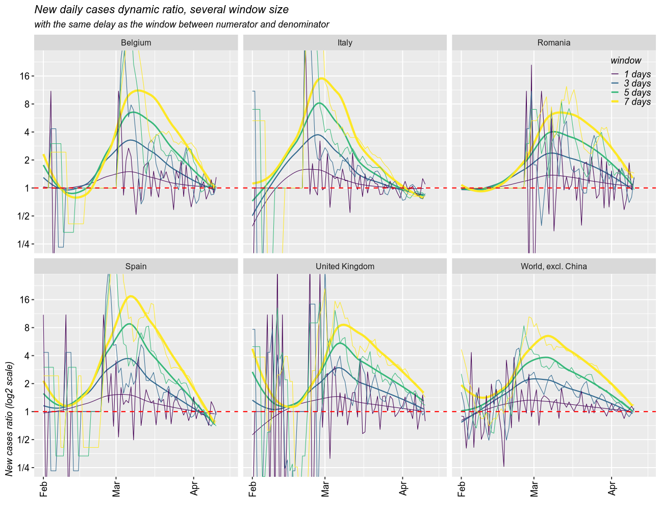
Delays of variable sizes scenario
Taking moving windows of 1 (the fastest and most instable), 3, 5, and 7 days (smoothed over 1 week), with a delay of the same sizes, I found a similar story.
full_data %>% #filter(location %in% c("Romania", "Italy", "Spain", "United Kingdom","Belgium")) %>%
  bind_rows(full_data_all) %>%
  mutate(`location` = forcats::fct_explicit_na(`location`, "World, excl. China ")) %>%
  filter(location %in% c("Romania", "Italy", "Spain", "United Kingdom", "Belgium",
                         "World, excl. China")) %>%
  mutate_if(is.integer, function(x){x[is.na(x)]=0; x+def}) %>%
  mutate(`new_cases_ratio_1` = rdiff(`new_cases`, default = def, windows=1, by=`location`, delay = 1) %>%
           limit_between(1/lim, lim, to.string = F)) %>%
  mutate(`new_cases_ratio_2` = rdiff(`new_cases`, default = def, windows=2, by=`location`, delay = 2) %>%
           limit_between(1/lim, lim, to.string = F)) %>%
  mutate(`new_cases_ratio_3` = rdiff(`new_cases`, default = def, windows=3, by=`location`, delay = 3) %>%
           limit_between(1/lim, lim, to.string = F)) %>%
  mutate(`new_cases_ratio_4` = rdiff(`new_cases`, default = def, windows=4, by=`location`, delay = 4) %>%
           limit_between(1/lim, lim, to.string = F)) %>%
  mutate(`new_cases_ratio_5` = rdiff(`new_cases`, default = def, windows=5, by=`location`, delay = 5) %>%
           limit_between(1/lim, lim, to.string = F)) %>%
  mutate(`new_cases_ratio_6` = rdiff(`new_cases`, default = def, windows=6, by=`location`, delay = 6) %>%
           limit_between(1/lim, lim, to.string = F)) %>%
  mutate(`new_cases_ratio_7` = rdiff(`new_cases`, default = def, windows=7, by=`location`, delay = 7) %>%
           limit_between(1/lim, lim, to.string = F)) %>%
  droplevels() %>%
  tidyr::gather("window", "new_cases_ratio", "new_cases_ratio_" %+% c(1, 3, 5, 7)) %>%
  mutate(`window` = str_remove_all(`window`, "new_cases_ratio_") %+% " days") %>%
  # mutate(`new_cases_ratio_march` = ifelse(`Date`>lubridate::ymd("2020-02-15"), `new_cases_ratio`, NA)) %>%
  # mutate(`new_cases_ratio_march` = ifelse(`total_cases`>2^(0.33*log2(max(`new_cases`))), `new_cases_ratio`, NA)) %>%
  ggplot(aes(x=`Date`, color=`window`)) + facet_wrap(`location`~., nrow=2)+
  geom_smooth(se=F, aes(y=`new_cases_ratio`, size=`window`), fullrange=T) +
  # geom_smooth(se=F, method="lm", aes(y=`new_cases_ratio_march`, size=`window`, weight=`Date`), fullrange=T, formula = y~poly(x, 2), color="black") +
  scale_size_manual(values = c(0.25, 0.5, 0.67, 1))+
  geom_line(aes(y=`new_cases_ratio`), size=0.25) + #geom_point(aes(y=`new_cases_ratio`)) +
  geom_hline(yintercept = 1, color = "red", lty="dashed")+
  scale_color_viridis_d("window")+
  scale_y_log10("New cases ratio (log2 scale)", breaks = 2^seq(-10, 10), limits = c(-lim,lim),
                labels = c("1/" %+% 2^(10:1), "1", 2^(1:10))) +
  scale_x_date("", limits = c(as.Date.character("2020-02-01"), as.Date.character("2020-04-15"))) +
  coord_cartesian(ylim=c(1/4, 24)) + perpendicular.labels.x +
  labs(title = "New daily cases dynamic ratio, several window size",
       subtitle = "with the same delay as the window between numerator and denominator")
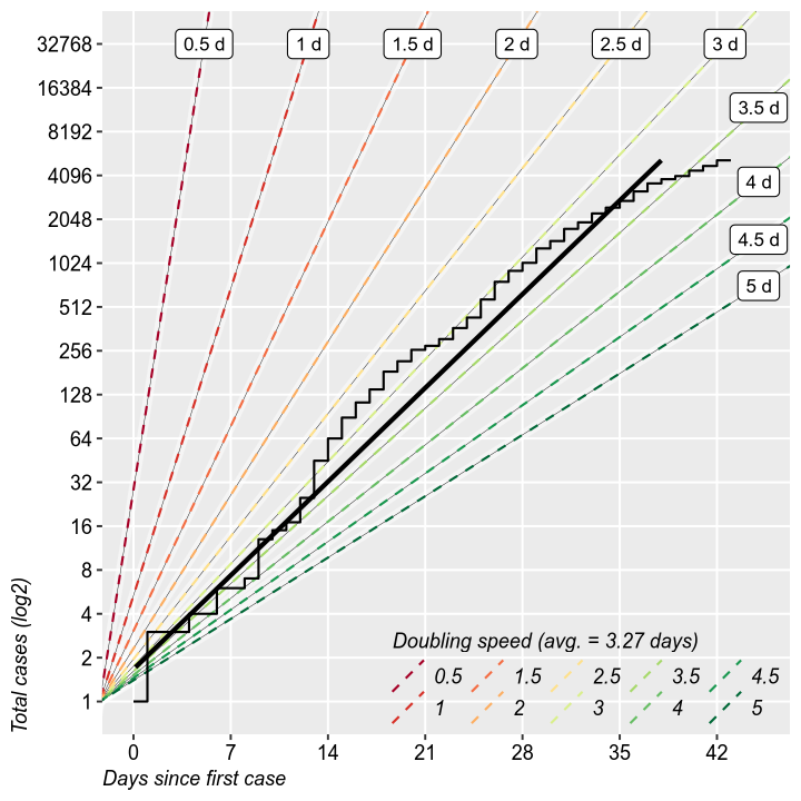
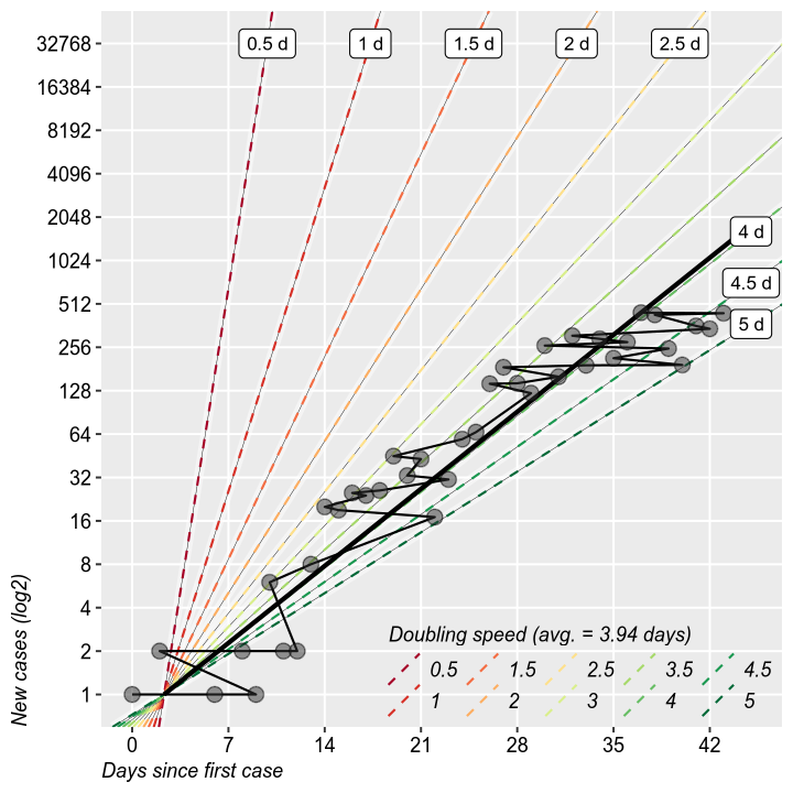
Rate of doubling
It is interesting to study the rate of doubling of the total and new cases. It is the same thing as the growth rate form the previous charts, but it makes for easier calculations of when will the epidemic reach a certain threshold. So far, we are at 3 days. Does not have much value otherwise.
reg_data <- full_data %>%
  filter(location %in% c("Romania")) %>%
  mutate(`total_cases` = log2(`total_cases`)) %>%
  filter(`total_cases` >= 0) %>%
  mutate(`date_num` = as.numeric(`Date`-lubridate::ymd("2020-01-01"))) #%>%

reg_data$date_num = reg_data$date_num - reg_data$date_num[1]

fit <- lm(data=reg_data, formula=`date_num` ~ `total_cases`)
ablines = data.frame(intercepts = fit$coefficients[1],
                     slopes = seq(0.5, 5, 0.5))

ablines$predicted_x <- ifelse(ablines$slopes > fit$coefficients[2], (45-fit$coefficients[1])/ablines$slopes, 15)
ablines$predicted_y <- ifelse(ablines$slopes > fit$coefficients[2], 45, fit$coefficients[1] + ablines$slopes * 15)

ggplot(reg_data, aes(x=`total_cases`, y=`date_num`)) +
  geom_abline(data=ablines, mapping = aes(intercept=`intercepts`, slope=`slopes`), color="white",
              alpha=0.5, lty="solid", size=2) +
  geom_abline(data=ablines, mapping = aes(intercept=`intercepts`, slope=`slopes`), color="black",
              lty="solid", size=0.1) +
  geom_abline(data=ablines, mapping = aes(intercept=`intercepts`, slope=`slopes`, color=factor(`slopes`)),
              lty="dashed", size=0.5) +
  scale_color_brewer("Doubling speed (avg. = " %+% scales::number(fit$coefficients[2], 0.01) %+% " days)",
                     palette = "RdYlGn") + legend.bottom_right +
  theme(legend.key.size = unit(5, "mm"))+
  guides(color = guide_legend(nrow = 2, byrow = F)) +
  geom_smooth(method = "lm", se=F, color="black", fulrange=T) +
  geom_label(data=ablines, aes(label=`slopes` %+% " d", y=`predicted_y`, x=`predicted_x`), size=3) +
  #geom_point() +
  geom_step() +
  scale_x_continuous("Total cases (log2)", breaks = 0:20, labels = 2^c(0:20)) +
  scale_y_continuous("Days since first case", breaks = seq(0,1000, 7), limits=c(0, 45)) +
  coord_flip() + no.minor_grid.x + no.minor_grid.y
reg_data <- full_data %>%
  filter(location %in% c("Romania")) %>%
  mutate(`new_cases` = log2(`new_cases`)) %>%
  filter(`new_cases` >= 0) %>%
  mutate(`date_num` = as.numeric(`Date`-lubridate::ymd("2020-01-01"))) #%>%

reg_data$date_num = reg_data$date_num - reg_data$date_num[1]

fit <- lm(data=reg_data, formula=`date_num` ~ `new_cases`)

ablines = data.frame(intercepts = fit$coefficients[1],
                     slopes = seq(0.5, 5, 0.5))

# predicted_y <- fit$coefficients[1] + fit$coefficients[2] * 10
ablines$predicted_x <- ifelse(ablines$slopes > fit$coefficients[2], (45-fit$coefficients[1])/ablines$slopes, 15)
ablines$predicted_y <- ifelse(ablines$slopes > fit$coefficients[2], 45, fit$coefficients[1] + ablines$slopes * 15)

# ablines$predicted_x <- 0

ggplot(reg_data, aes(x=`new_cases`, y=`date_num`)) +
  geom_abline(data=ablines, mapping = aes(intercept=`intercepts`, slope=`slopes`), color="white",
              alpha=0.5, lty="solid", size=2) +
  geom_abline(data=ablines, mapping = aes(intercept=`intercepts`, slope=`slopes`), color="black",
              lty="solid", size=0.1) +
  geom_abline(data=ablines, mapping = aes(intercept=`intercepts`, slope=`slopes`, color=factor(`slopes`)),
              lty="dashed", size=0.5) +
  scale_color_brewer("Doubling speed (avg. = " %+% scales::number(fit$coefficients[2], 0.01) %+% " days)",
                     palette = "RdYlGn") + legend.bottom_right +
  theme(legend.key.size = unit(5, "mm"))+
  guides(color = guide_legend(nrow = 2, byrow = F)) +
  geom_smooth(method = "lm", se=F, color="black", fullrange=T) +
  geom_line() + geom_point(size=3, pch=21, fill="grey20", alpha=0.5) +
  # geom_step() +
  geom_label(data=ablines, aes(label=`slopes` %+% " d", y=`predicted_y`, x=`predicted_x`), size=3) +
  scale_x_continuous("New cases (log2)", breaks = 0:20, labels = 2^c(0:20)) +
  scale_y_continuous("Days since first case", breaks = seq(0,1000, 7), limits=c(0, 45)) +
  coord_flip() + no.minor_grid.x + no.minor_grid.y
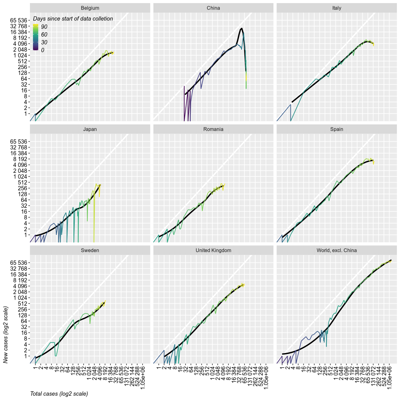
Trajectories
This chart shows the relation between the growth rates of new cases and total cases. It shows quite dramatically the end of the epidemic as a sudden drop. So far, only China has reached that point (maybe).
full_data %>% #filter(location %in% c("Romania", "Italy", "Spain", "United Kingdom", "Sweden","Japan", "South Korea","China")) %>%
  bind_rows(full_data_all) %>%
  mutate(`location` = forcats::fct_explicit_na(`location`, "World, excl. China ")) %>%
  filter(location %in% c("Romania", "Italy", "Spain",
                         "United Kingdom", "Belgium", "Sweden",
                         "South Korea", "Japan","China",
                         "World, excl. China")) %>%
  # mutate_if(is.integer, function(x){x[is.na(x)]=0; x+0.1}) %>%
  droplevels() %>%

  ggplot(aes(x=`total_cases`, y=`new_cases`)) +
  facet_wrap(`location`~.)+
  geom_abline(color="white", size=1)+
  geom_smooth(se=F, fullrange=T, span=0.75, alpha=0.5, color="black") +
  geom_line(size=0.5, aes(color=as.numeric(`Date`-as.Date.character("2020-01-01")))) +
  # geom_point(size=0.5) +
  # geom_hline(yintercept = 1, color = "red", lty="dashed")+
  # scale_color_viridis_d("location")+
  scale_color_viridis_c("Days since start of data colletion", breaks=seq(0, 365, 30))+
  scale_y_log10("New cases (log2 scale)", breaks = 2^seq(0, 16), labels = scales::label_number_auto()) +
  scale_x_log10("Total cases (log2 scale)", breaks = 2^seq(0, 20), labels = scales::label_number_auto()) +
  legend.top_left + perpendicular.labels.x + no.minor_grid.x + no.minor_grid.y
Final remarks
Althogh still in exponential growth, Romania seems to keep the epidemic under control, and is expected to return to linear growth and eventual resolution within several weeks. Quarantine measures seem effective. I keep my peronal prediction of 2^11 to 2^15. At this point it unlikely to have less than 8000 cases and I won’t be surprised to see 64k cases.
My prediction is that we will soon enter a period of linear growth and no complete resolution this year. Quarantine measures may not be possible to a sufficient level during autum due to economic reasons, which means that during the next cold season we may experience a much more severe epidemic, with causalties in the hundreds or thousands.
This report has severe limitations due to the nature of the data. It is impossible to calculate the real number of cases among untested individuals, since almost all tests were performed in people already at higher-than-average likelyhood of being infected. Long-term research is needed to develop tests that are accurate in predicitng clinical disease and differenctiating it form carrier status.